The importance of typography in web design

Typography has a rich history, with its roots extending as far back as Egyptian hieroglyphics. Communicating ideas and concepts has always been a core part of human experience and culture, making typography a key part of this domain. How does this ancient art translate into today's digital landscape and why is it so important?
In this post, we’ll break down some of the key reasons why typography is an integral part of web design and how it can enhance the readability and accessibility of your content.
What role does typography play in web design?
Web typography is more than just choosing which font to use for your website. It’s about ensuring your content is readable, visually appealing and accessible. Typography in a web context describes how the font or typeface is applied on the page to ensure that it is legible and adequately delivers the message it’s trying to convey. It describes how text is arranged into headings and paragraphs that forms the visual hierarchy on the page.
Web typography is also a reflection of your brand's identity, taking on styles from your brand guidelines and being the carrier for your brand's tone of voice. A highly considered typographic structure ensures that users stay engaged with your content. You could write the best news article or craft the best donation form but if the text is hard to read, users may simply quit because it wasn’t as easy as it should have been to read.
How do we approach typography?
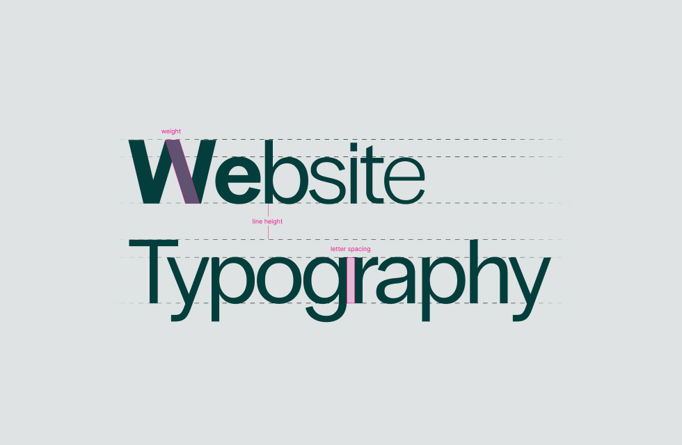
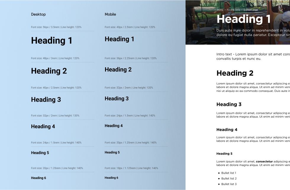
Digital Garden carefully crafts a typographic system for each project to meet the needs of our clients. This system is set up in Figma, allowing us to maintain a consistent set of key attributes such as font size, weight, line spacing and more for each style.
Here’s a few things we look out for when setting up the typographic system:
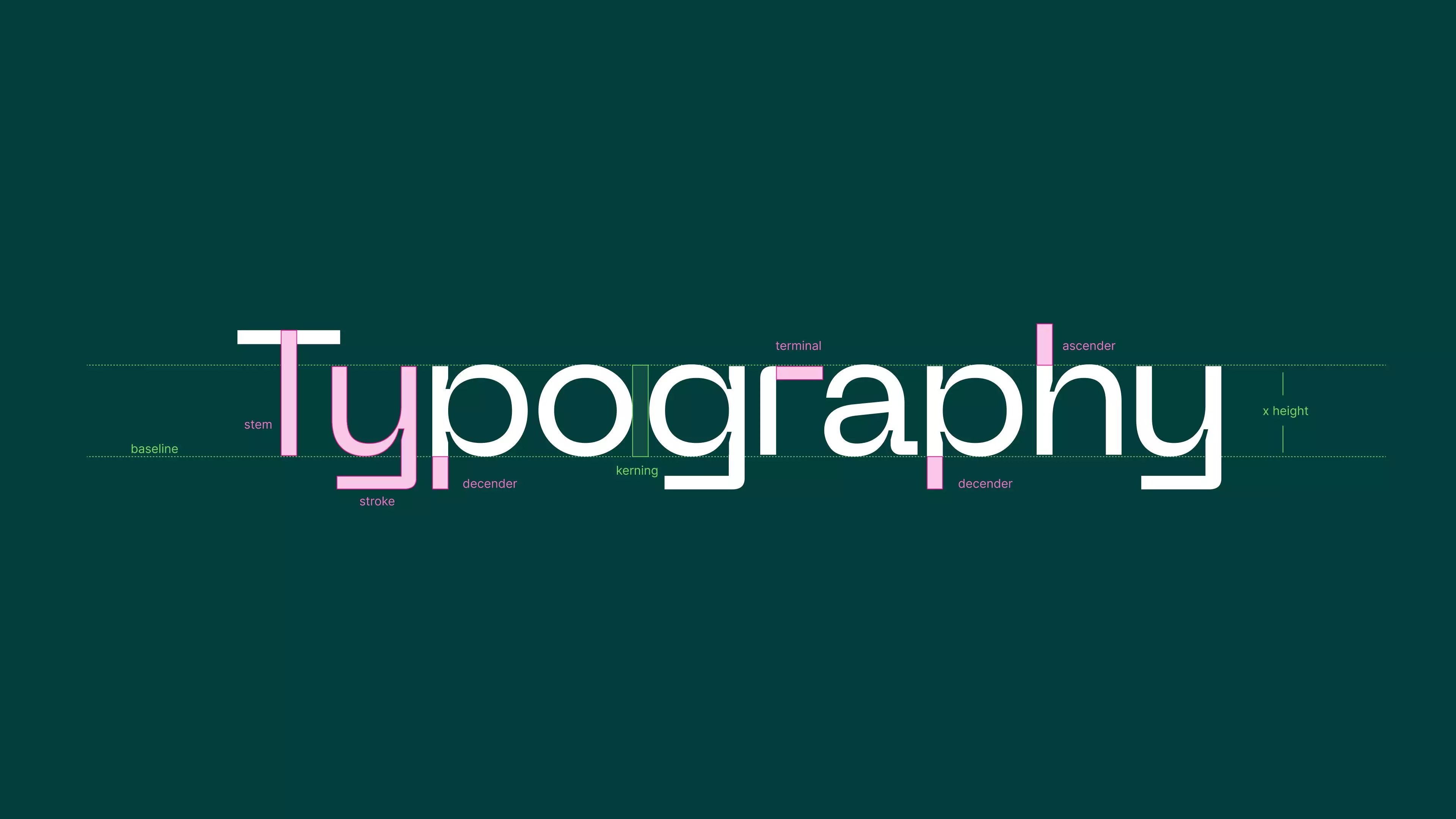
Hierarchy
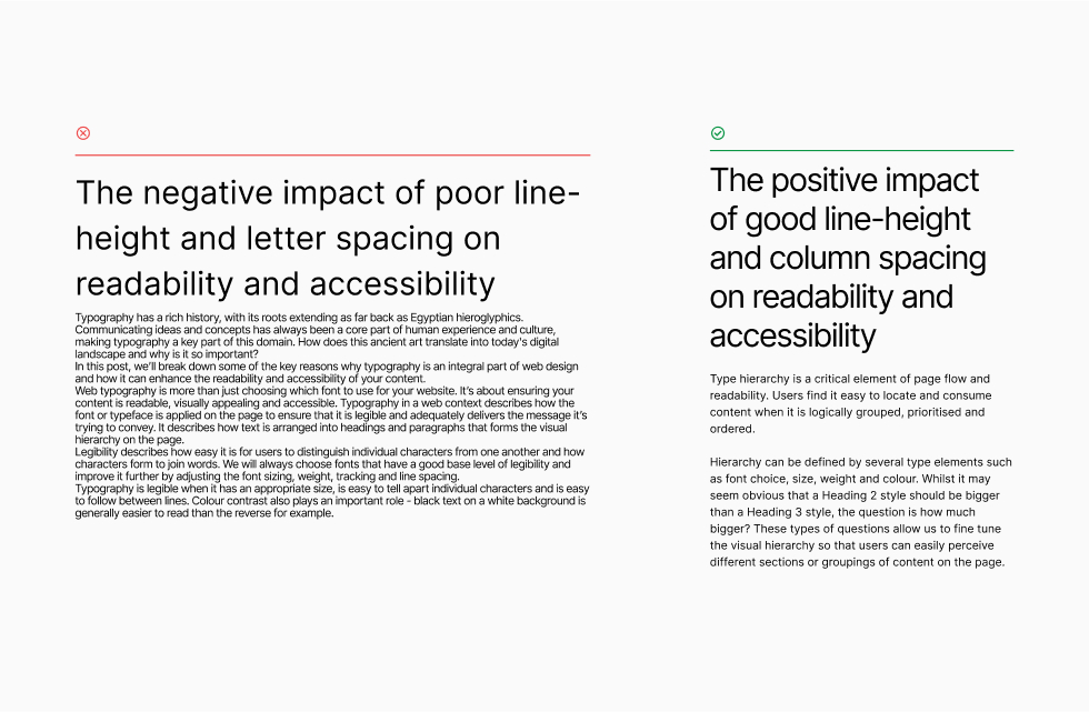
Type hierarchy is a critical element of page flow and readability. Users find it easy to locate and consume content when it is logically grouped, prioritised and ordered. Hierarchy can be defined by several type elements such as font choice, size, weight and colour. Whilst it may seem obvious that a Heading 2 style should be bigger than a Heading 3 style, the question is how much bigger? These types of questions allow us to fine tune the visual hierarchy so that users can easily perceive different sections or groupings of content on the page.
Legibility
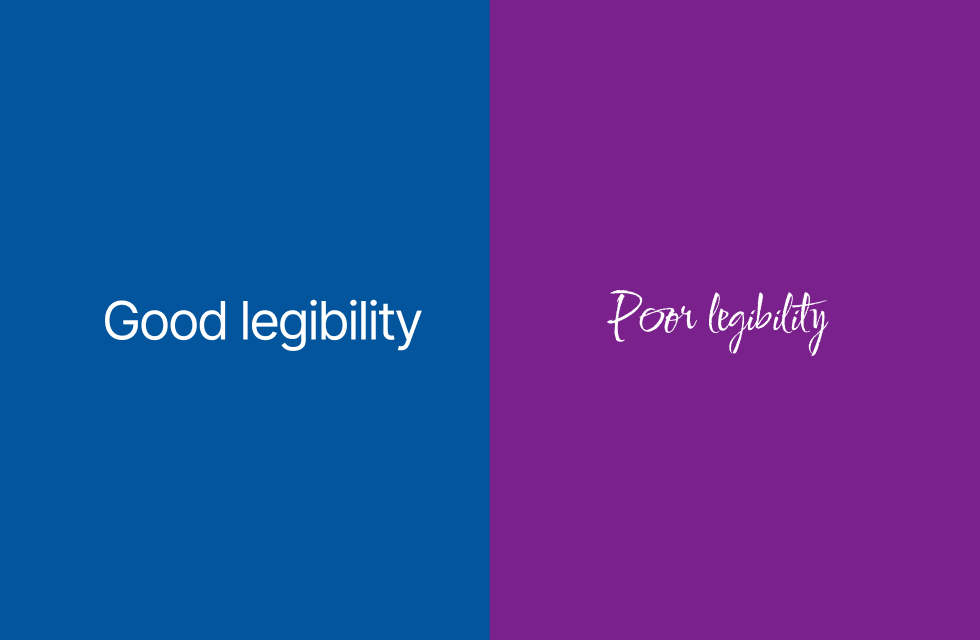
Legibility is a core part of typography and is among the lowest level considerations for the comprehension of text. This principle is key to making typography accessible for all kinds of users.
Legibility describes how easy it is for users to distinguish individual characters from one another and how characters form to join words. We will always choose fonts that have a good base level of legibility and improve it further by adjusting the font sizing, weight, tracking and line spacing.
Typography is legible when it has an appropriate size, is easy to tell apart individual characters and is easy to follow between lines. Colour contrast also plays an important role - black text on a white background is generally easier to read than the reverse for example.
Readability and accessibility
Readability refers to how easily text can be understood as a whole and builds upon the concept of legibility. Readability can be measured by computer generated metrics such as ‘reading level’, referring to formal education grade levels that would be able to comprehend the text.
Additional visual properties of text should be considered to ensure readability and accessibility, such as line height and line length. For example, having a line length of more than 60 characters per line can make following sentences and paragraphs difficult.
Why is typography important on my website?
Without proper typography your content simply won't be easy to understand. Typography applies to all parts of your website, whether it’s a news article, landing page or text in a mega-menu. Users have high standards and low attention spans, meaning if your typography is not up to scratch, they will leave the website and not achieve their goals.
Next time you look at your website, think about its typography and whether it’s having an impact on the user experience.