Stories-first website & donation platform

Stories-first website & donation platform

client-logo

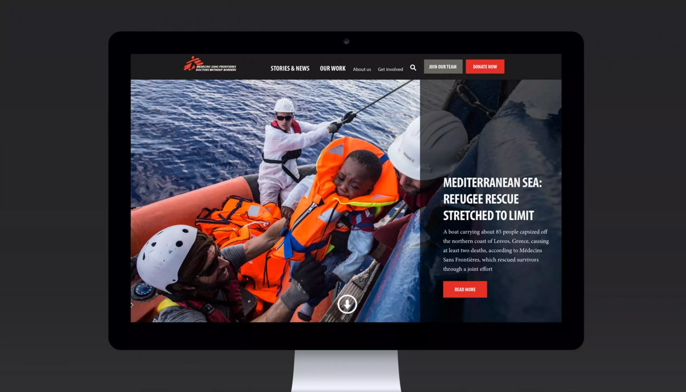
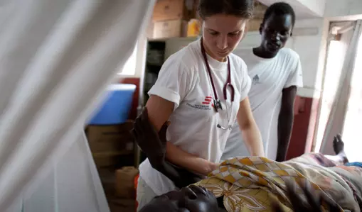
Having a first person stories approach provided a window into the Médecins Sans Frontières field realities in a way that everyone can relate to, inspiring people to support.

project-slider
project-slider
project-slider

Design Brief

Médecins Sans Frontières (MSF) is the world’s leading independent organisation for medical humanitarian aid. There are 19 offices in multiple countries across the globe and more than 24000 MSF field staff are providing assistance for those caught in various crisis around the world every day. 

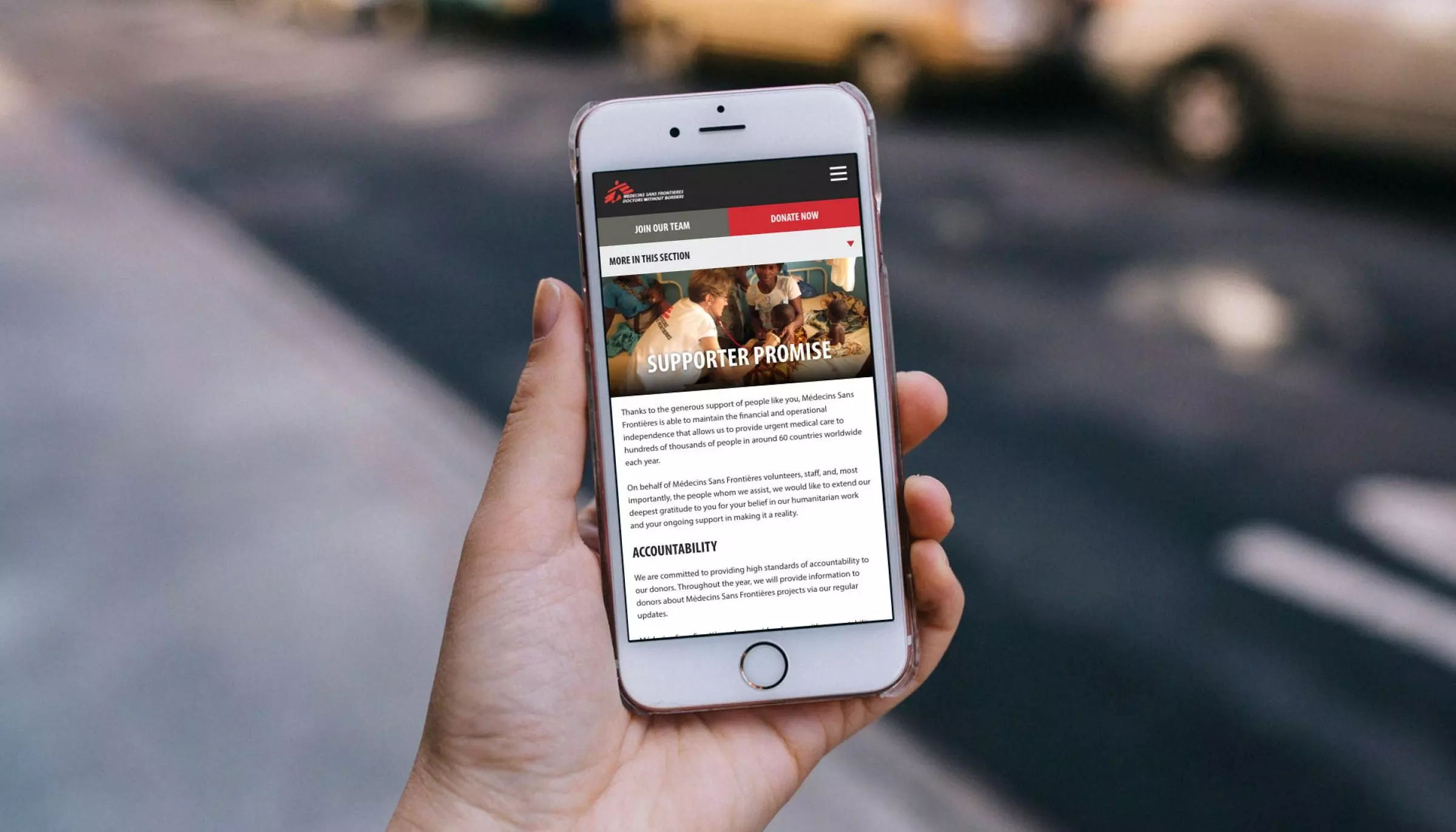
The challenge of this project was to encompass design and development of the new website whilst working with their existing Drupal CMS that was preconfigured with content types and taxonomies for content. Mobile first in terms of navigation design was the key vision in this Interface Design and Integration project.

The following is a list of tasks that were identified by MSF for Digital Garden to perform in this project:

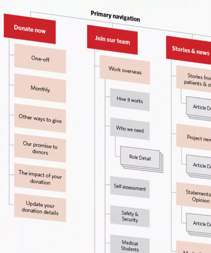
  • Tweak information architecture to make it more accessible

  • Improve the current navigation to be more user friendly

  • Simplify the homepage to remove clutter and focus on the goals

  • Condense 1st level navigation in order to simplify the journey to the identified goals

  • Improve overall readability of content and increase call to action prominence

project-mosaic-item
project-mosaic-item
project-mosaic-item
Information Architecture

Information Architecture

As part of our design process, Digital Garden conducted User Experience research to understand potential users of the website.

What we wanted to find out was:

  • What kinds of content we expect will resonate with users
  • What users might want when using the MSF website
  • Users’ behaviour as they interact with a MSF digital experience
Stories first approach

Stories first approach

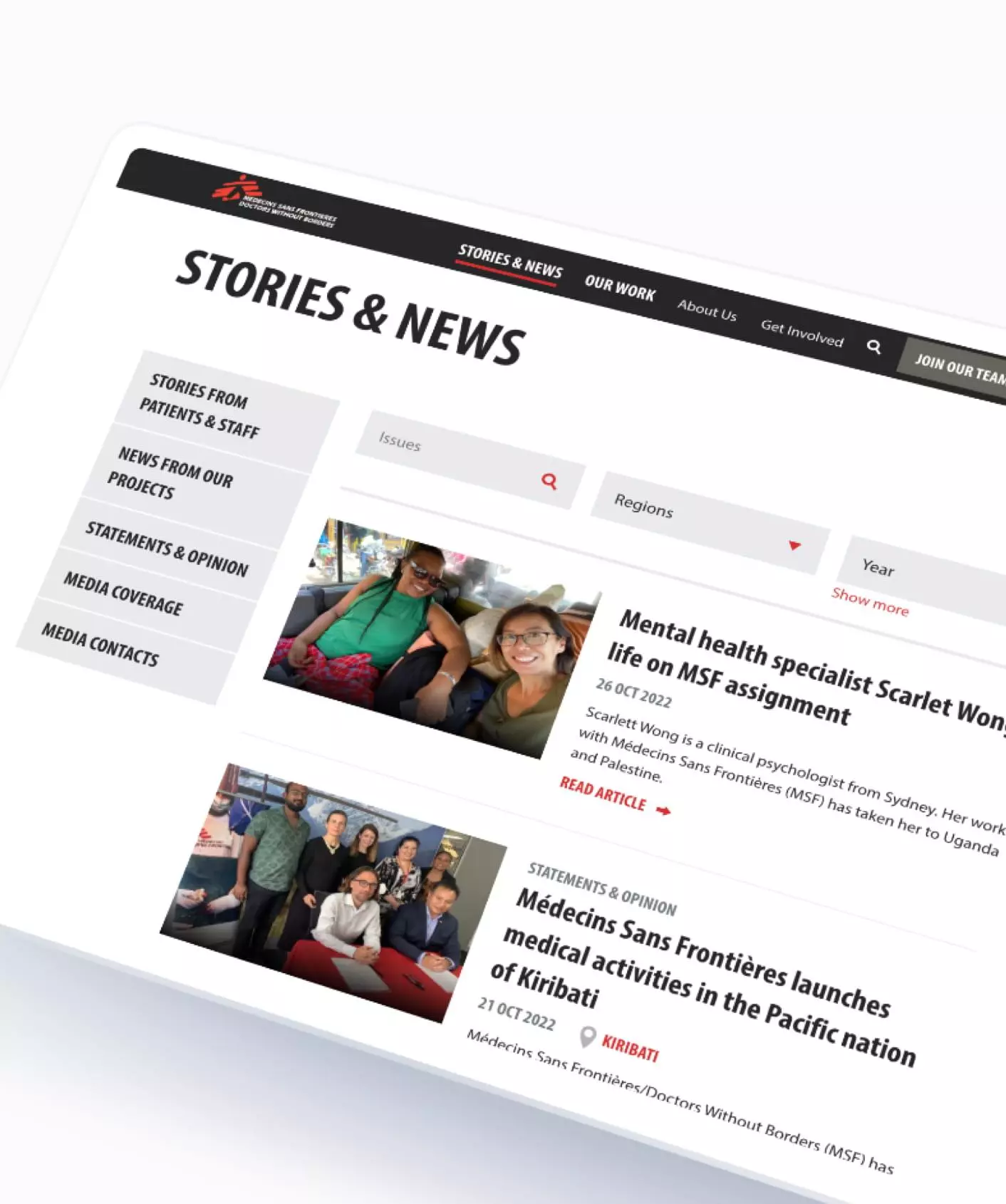
Stories & News section of the MSF website, includes articles of inspiring stories and the latest news from around the world and in Australia.

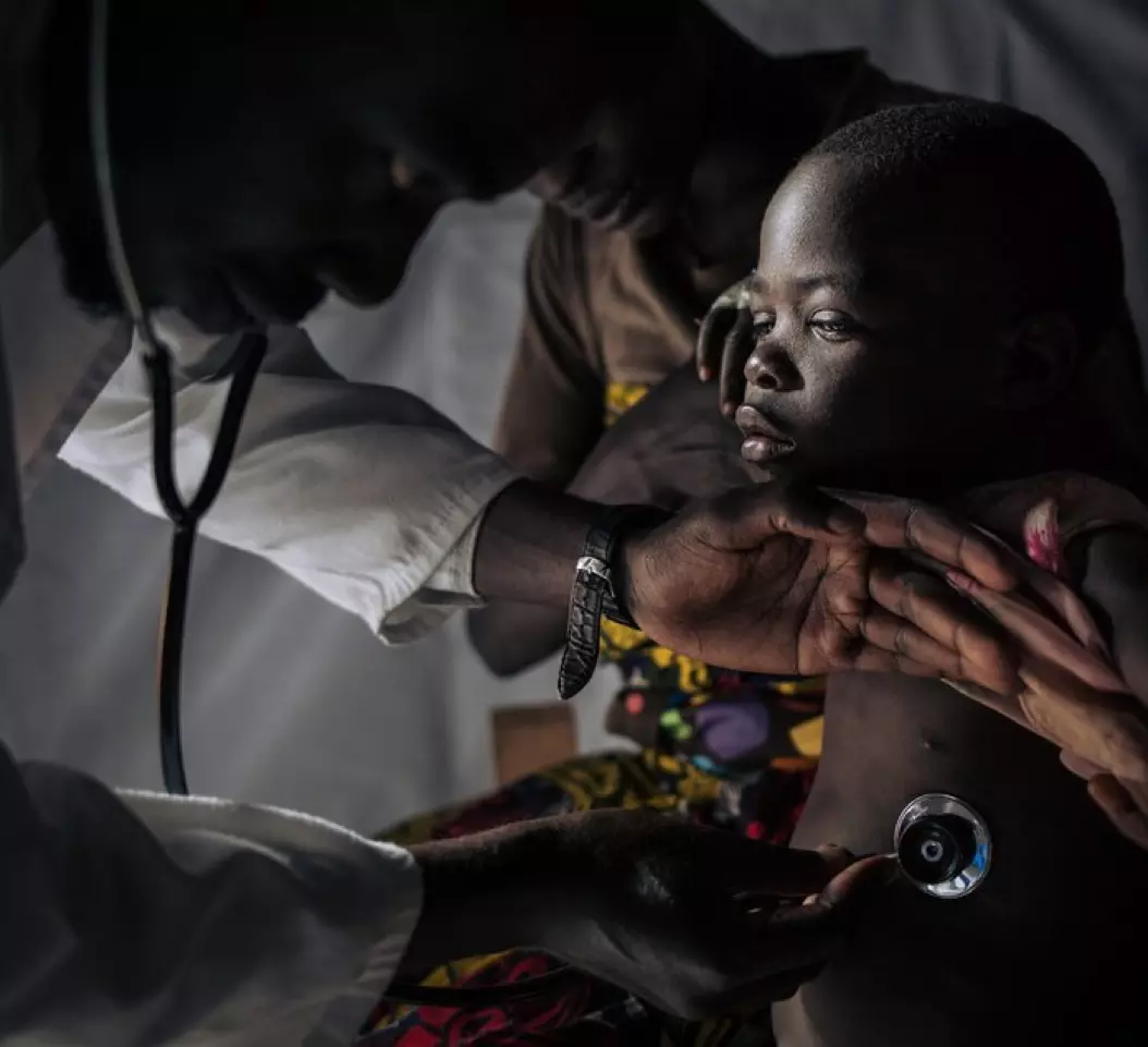
First person stories provide a window into the MSF field realities in a way that everyone can relate to and inspire people to support.

Enhanced customer experience

Enhanced customer experience

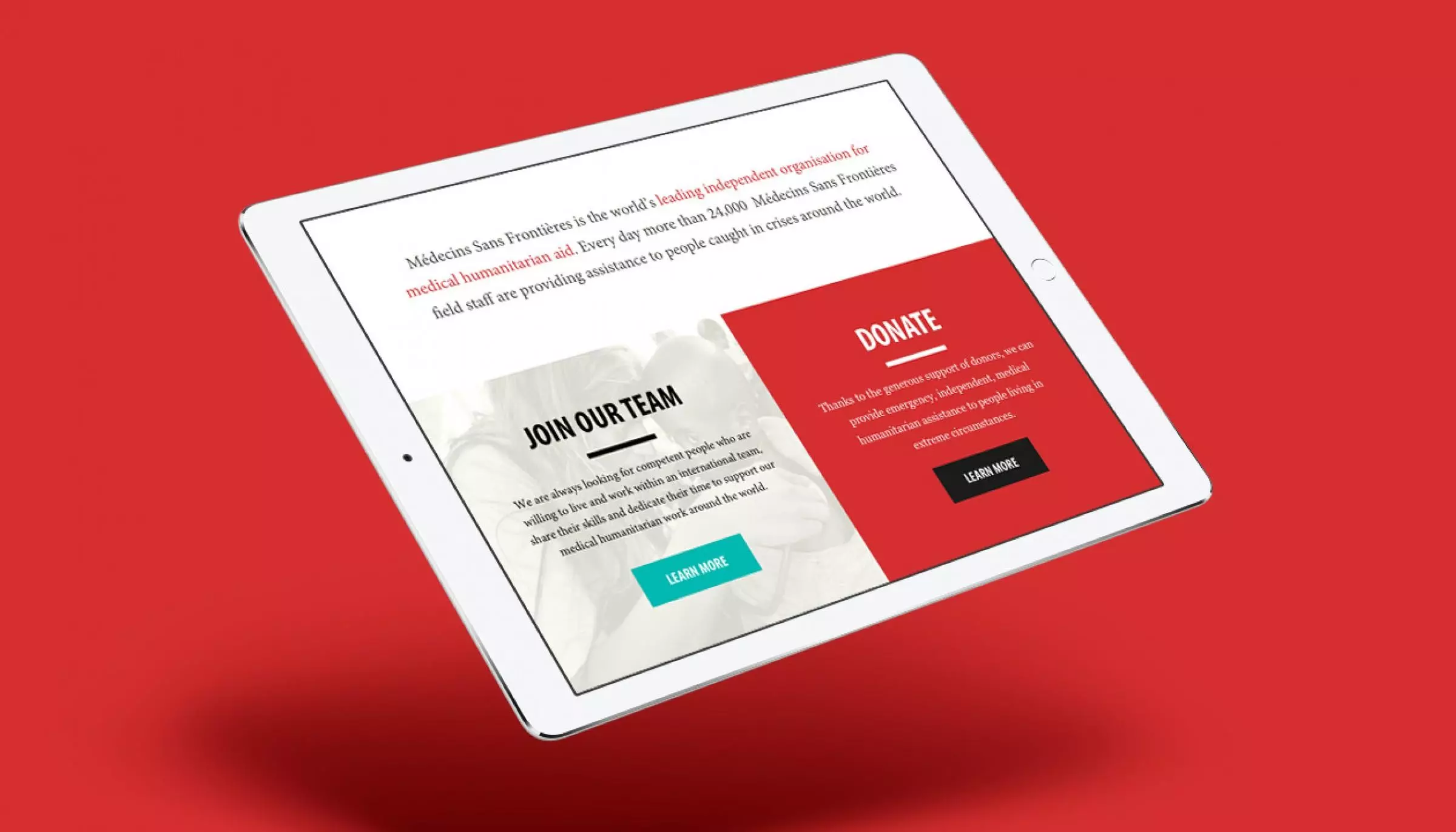
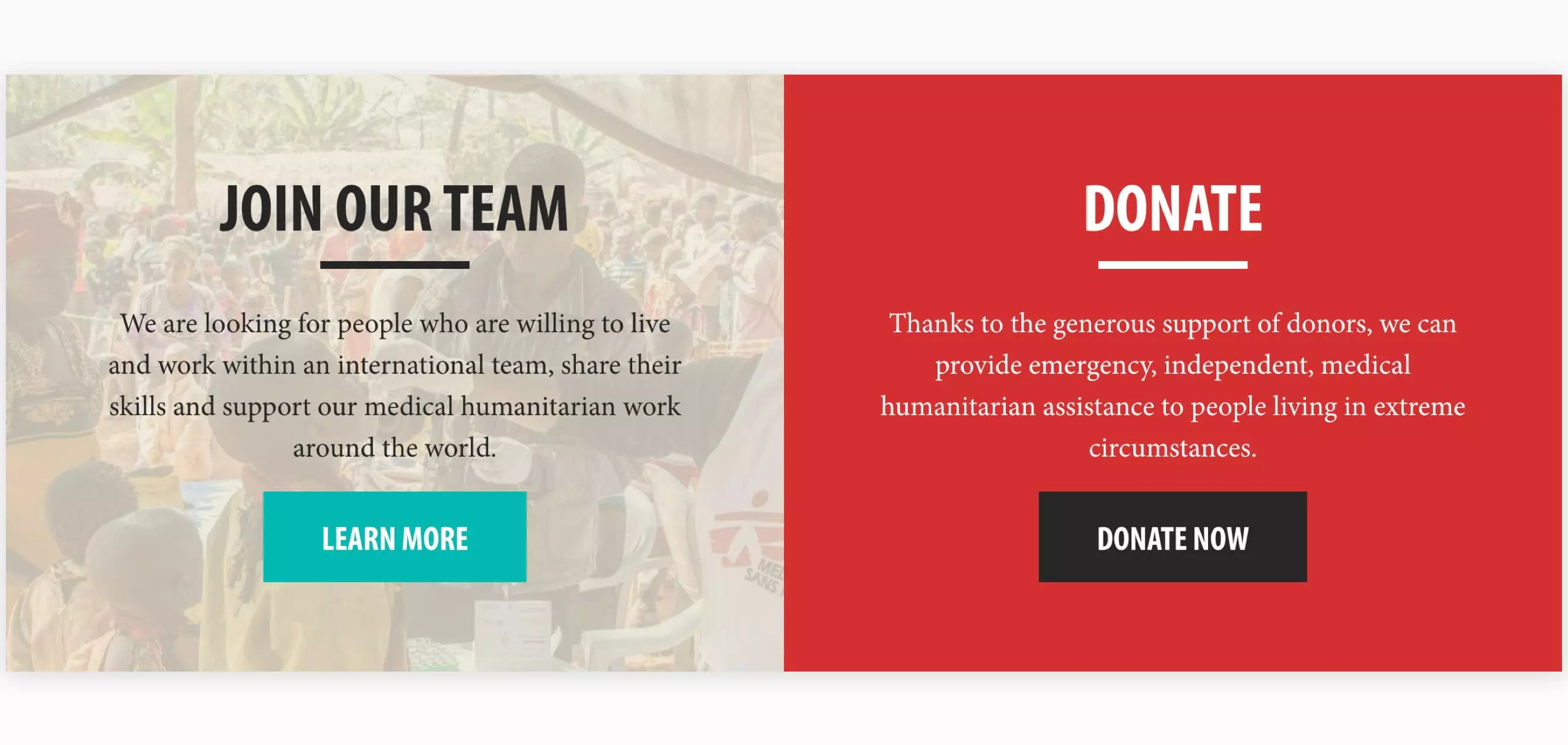
By detaching the two main call to actions out of the navigation (donate, join our team) and implementing a visual hierarchy on the main navigation to add emphasis to the most important sections, we simplify the user’s journey and help them get to where they want to go.

We also implemented a navigational pattern that allows the user to have a brief overview of what each menu link is about just by hovering where they get presented with a short description, one of the major highlights in this improved navigation system.

Donation platform

Donation platform

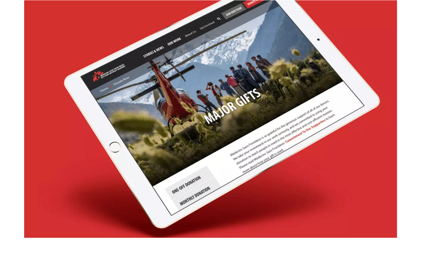
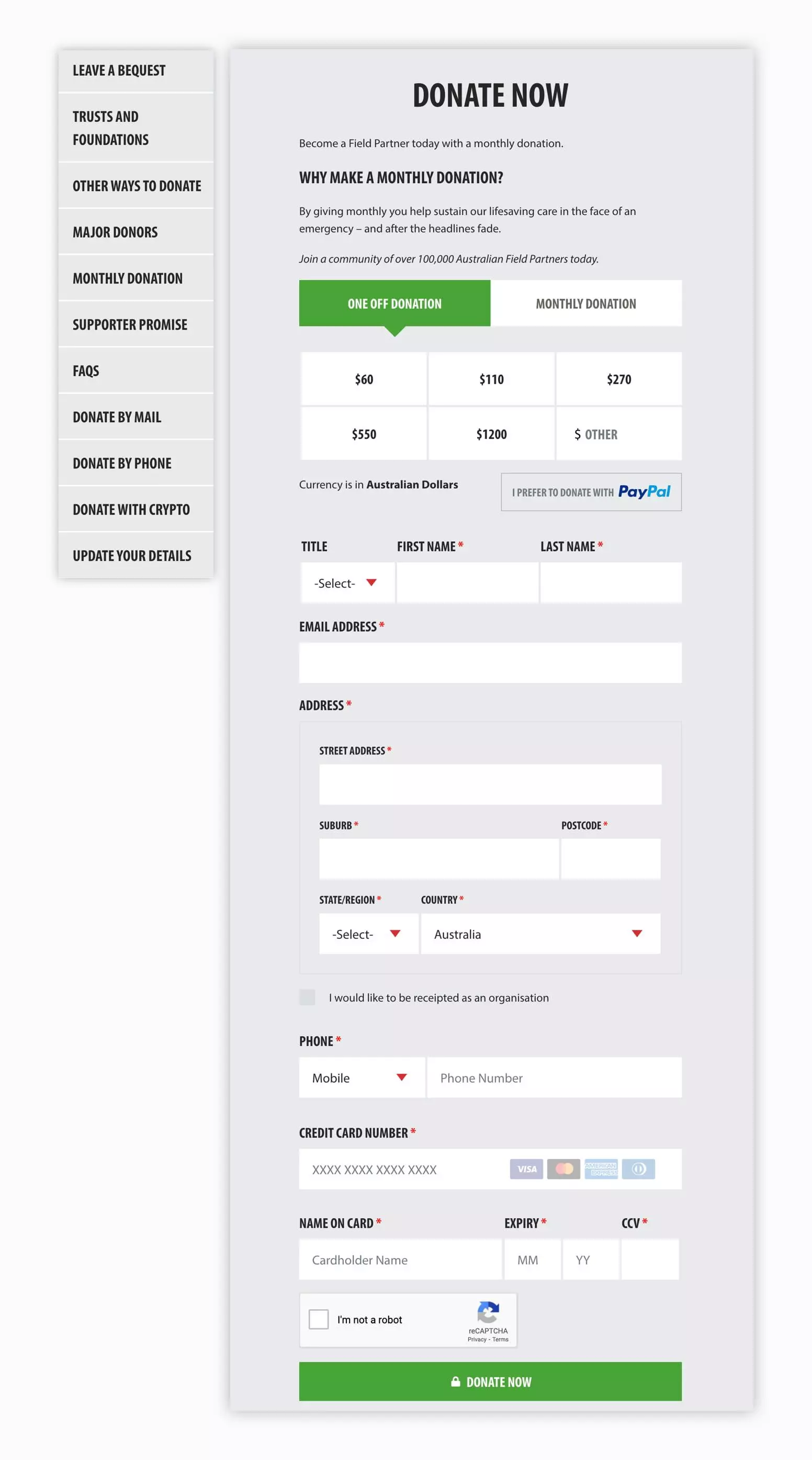
The new donation experience is informed with clear step labels, predictive google address API and field input.

It was built to allow easy management and creation of donation forms, alleviate pressure on customer service teams and increase overall conversions allowing donors to process real time donations across multiple payment options.

Results


Consistent communication and collaboration between Digital Garden and the MSF Australia team resulted in a well designed, truly modern, smooth flowing and story first website.  

Increase in revenue over the first 12 months

52%

Increase in donations over that period

41%