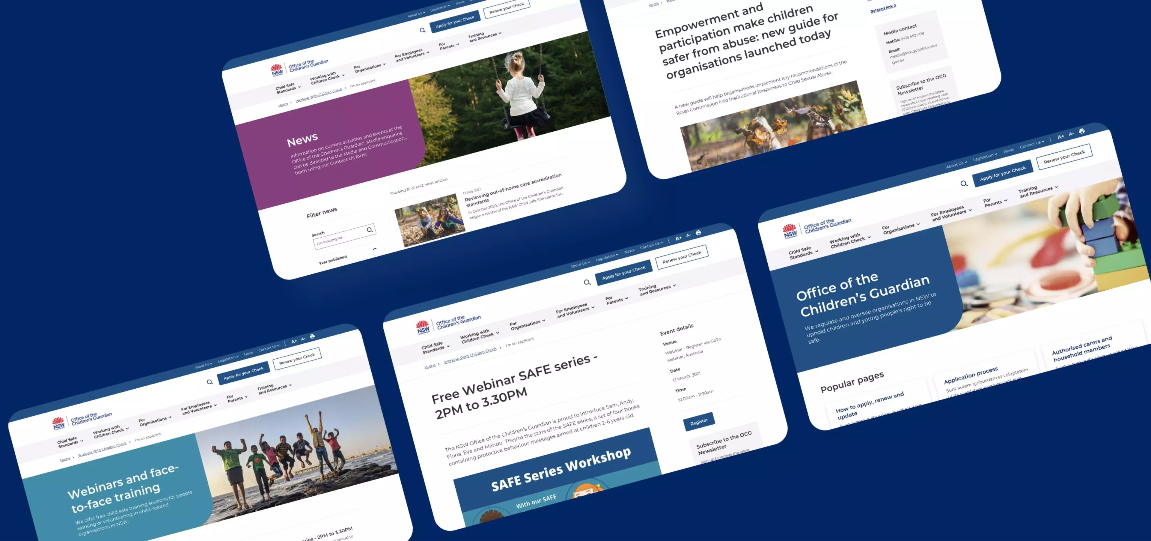
The Office of the Children’s Guardian (OCG) is an independent authority that aims to protect children and promote child safe organisations in Australia. OCG has worked with Digital Garden for around 14 years, the latest project we have been collaborating together on is the website.
We split the project into 3 phases.
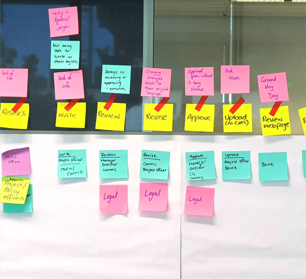
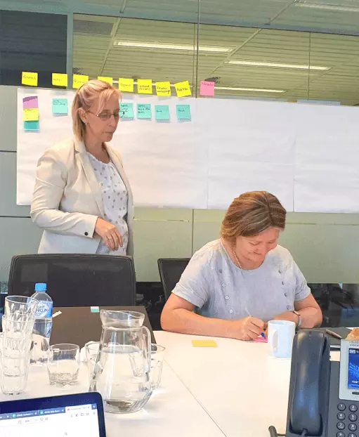
For Phase 1 of the project, we created a content strategy and governance framework along with an activity findings report that analysed a number of areas such as persona development, site precedents, card sorting and a proposed IA.
IA development was based on knowledge collected in stakeholder workshops, the user survey, data from google analytics and landscape review.
Three main criteria were created to use in our IA development:
-
Simplify language - Identified through personas and landscape review. The objective was to remove inward-facing language and jargon.
-
Improve structure - Based on stakeholder card-sorting and landscape review. The goal is to restructure the IA to create more logical groupings. Data from Google Analytics helped us decide which areas of the site were traversed the most.
-
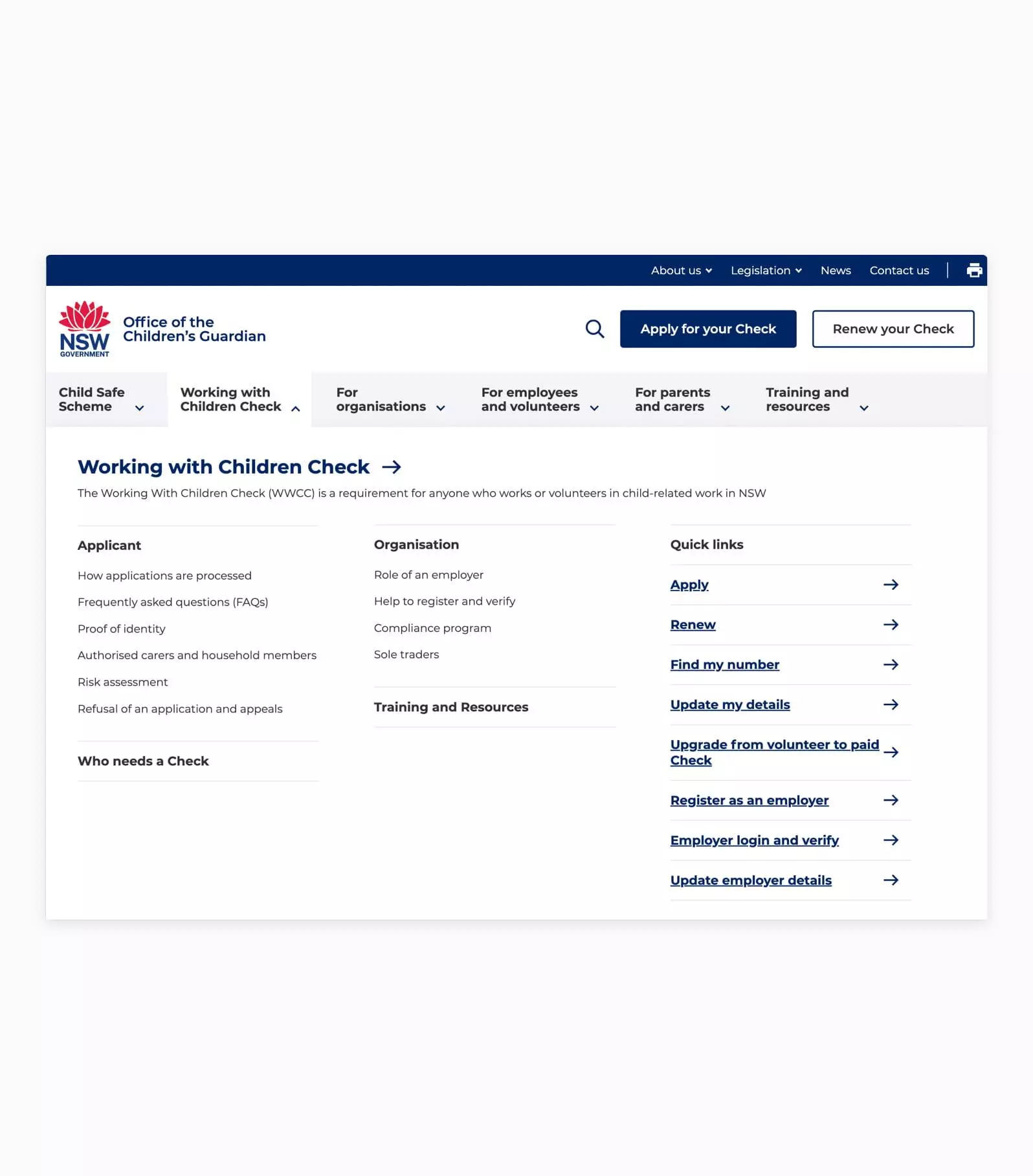
Enhance process discovery - Based on persona scenarios and stakeholder workshops. The goal is to bring common OCG processed into the menu for faster access.
We presented two IA models, and refined one model after extensive tree-testing, and stakeholder input. The final deliverable was a user research report, containing results from a tree-test and user survey and the final signed off IA.
Results from Phase 1 concluded with a set of suggestions and guidelines allowing stakeholders to have a clear vision moving forward into the next phase. The new content model and IA structure allow users to easily and quickly find the information that they are looking for.
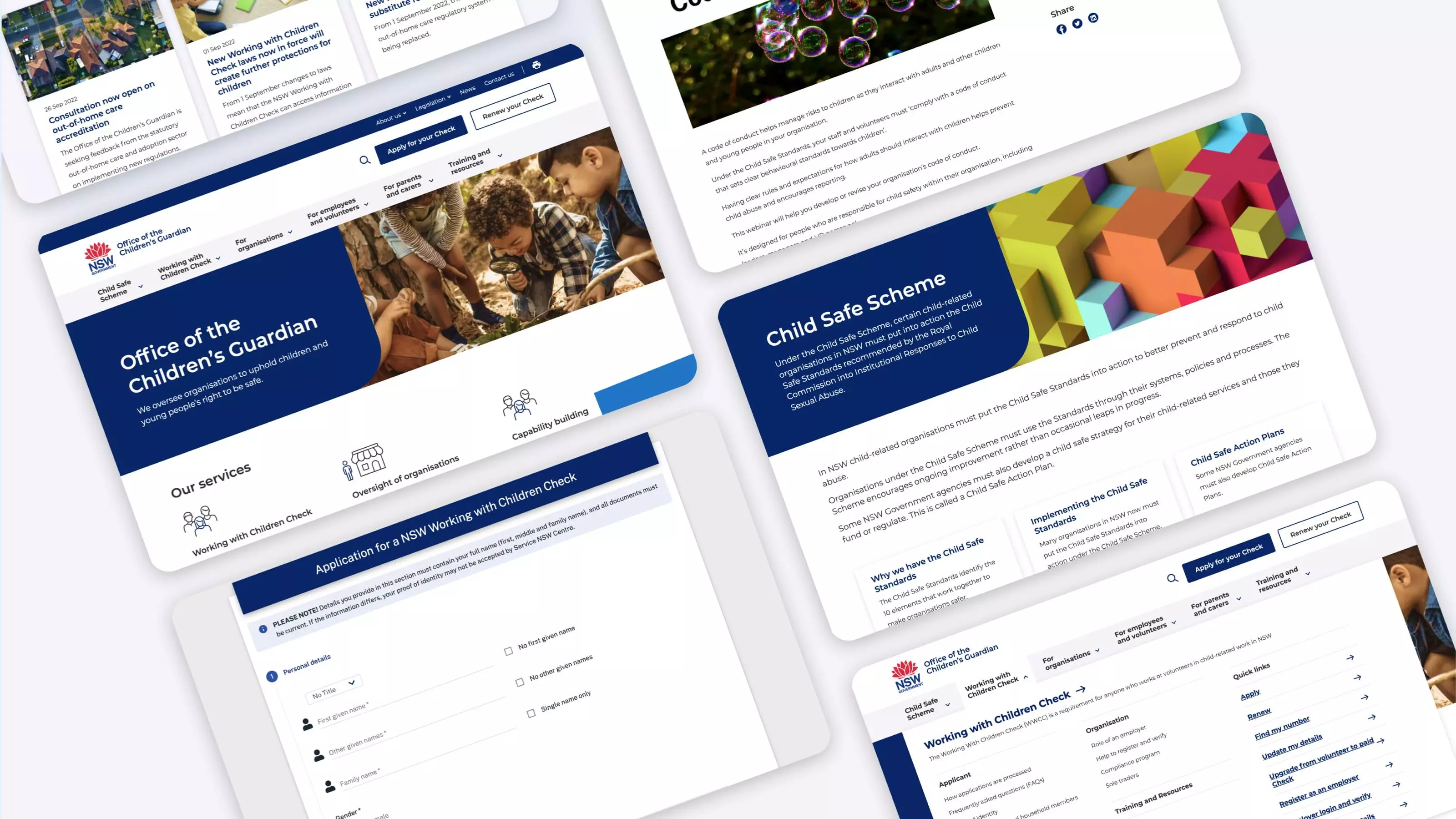
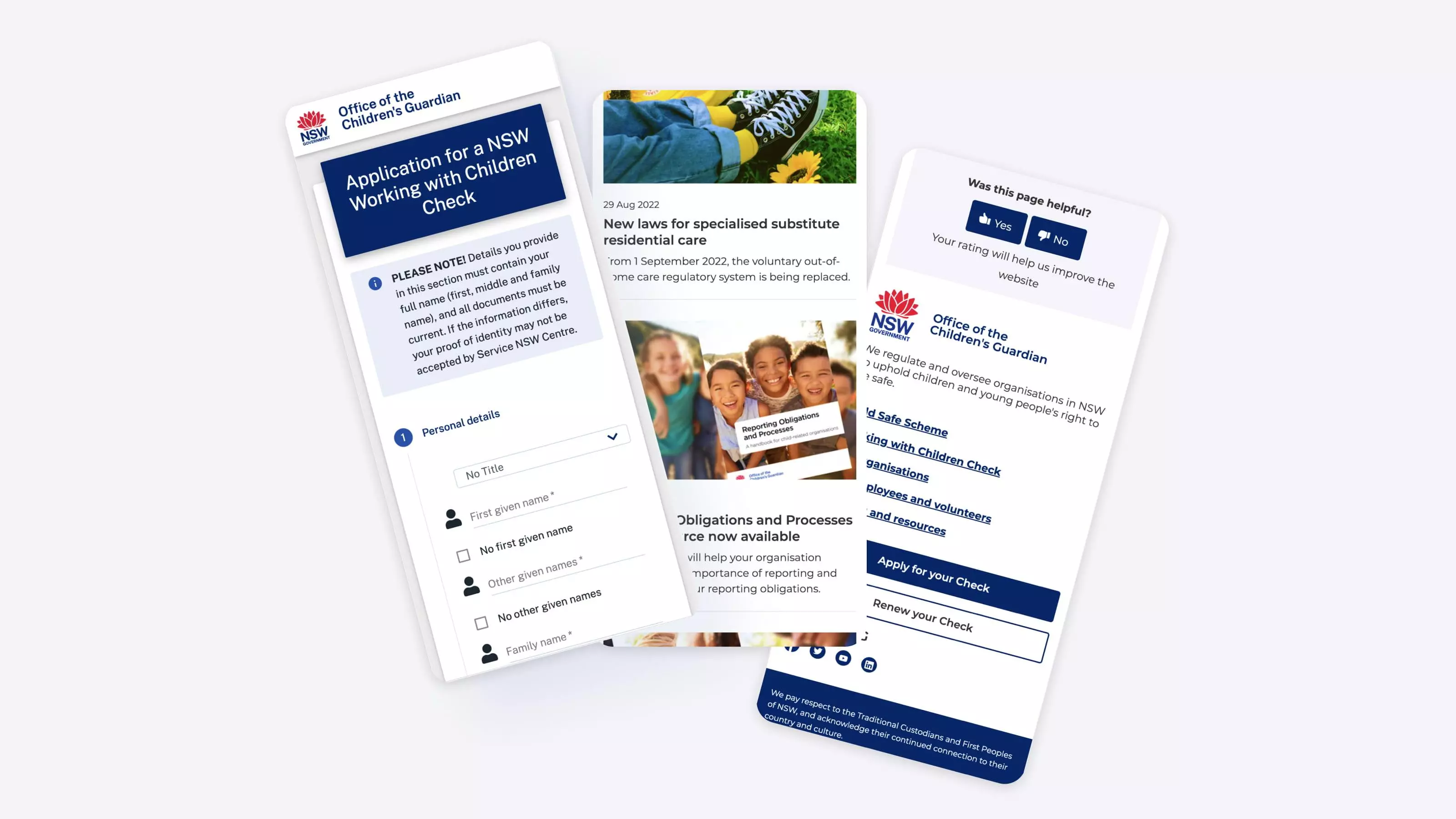
For Phase 2, Digital Garden prototyped the website, designed the UI based on the NSW government design system, and then tested the UI, ensuring research and suggestions inform the design. We also conducted a co-design workshop to ensure we produced a design that reflects the clients’ goals and vision for the website.
Finally, for Phase 3, we developed the website on Drupal 9 and gave multiple training sessions and videos on how to use the new system, to the OCG content team. The website went through pen testing, prior to going live in mid-February 2022.


