Cumberland Council, in Sydney’s western suburbs, is one of the most culturally diverse and vibrant Local Government Areas (LGA) in NSW. As a result, Cumberland Council has an active focus on community-building and providing an extensive range of municipal services for its residents.
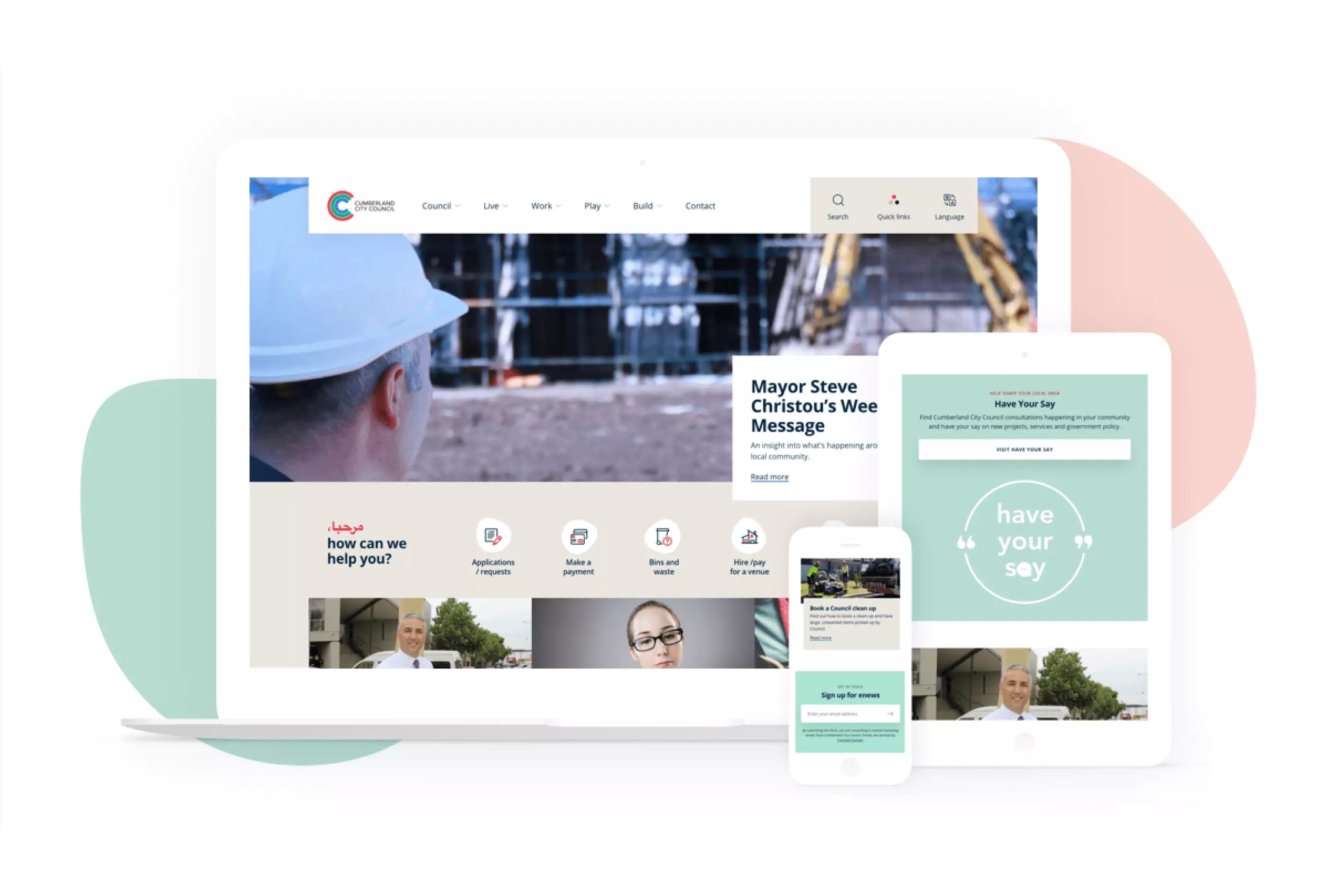
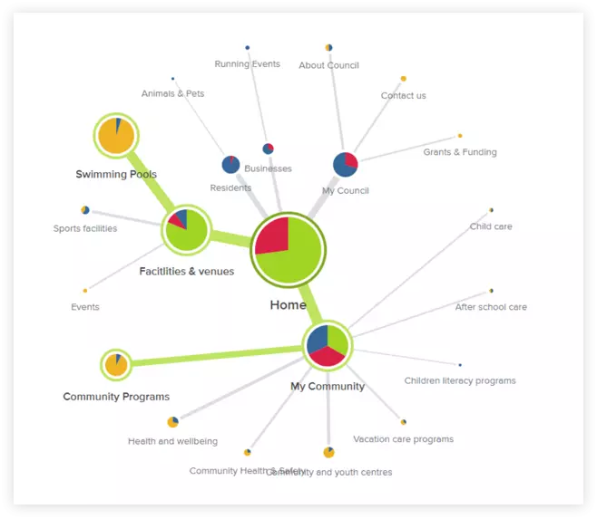
While the Cumberland Council’s website has a wealth of information available online, much of it is inaccessible due to poor information architecture (IA) and confusing user interface (UI) design. We decided on a multi-phase approach for this project.
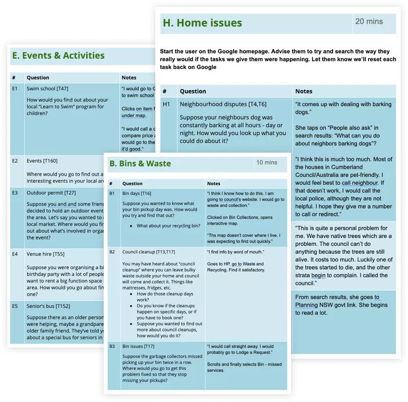
We conducted user research using the following methods:
- Expert review of the current Cumberland Council website
- High-level Landscape analysis
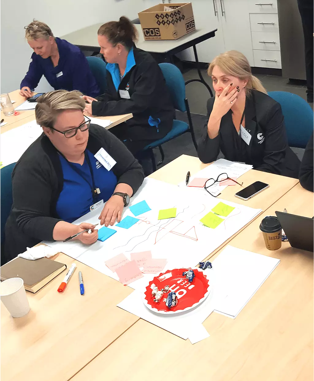
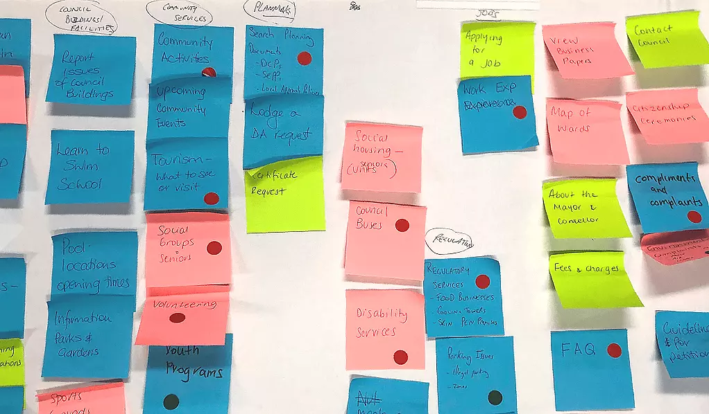
- SME research workshops
We performed an expert review of the Council’s website in order to understand any initial problems with the usability of the site. An integrated landscape analysis, which reviews and compares similar sites, was carried about and included in a report. This will provide a baseline understanding of how the site works and the most common different functions and services offered to users. We also conducted internal research with Cumberland Council staff to understand the vision for the website according to the SMEs (Subject Matter Experts) and identify current problems and concerns.
Our job was to make the Cumberland Council website easier for residents to find important information about living in the Cumberland council area.
Our key findings include:
- Users were not able to find relevant information quickly enough, impacting on their user experience negatively
- Key pages such as development applications and bin days could benefit from a simpler design and reorganisation of layout and content
- Pages and content require clearer “signposting” and labelling, and so improving the IA was a vital step
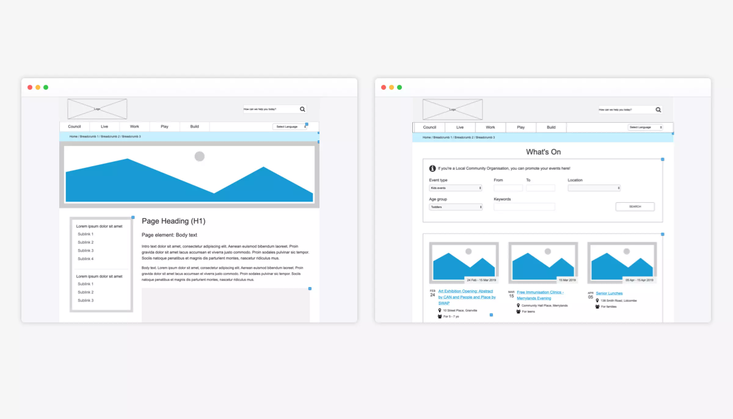
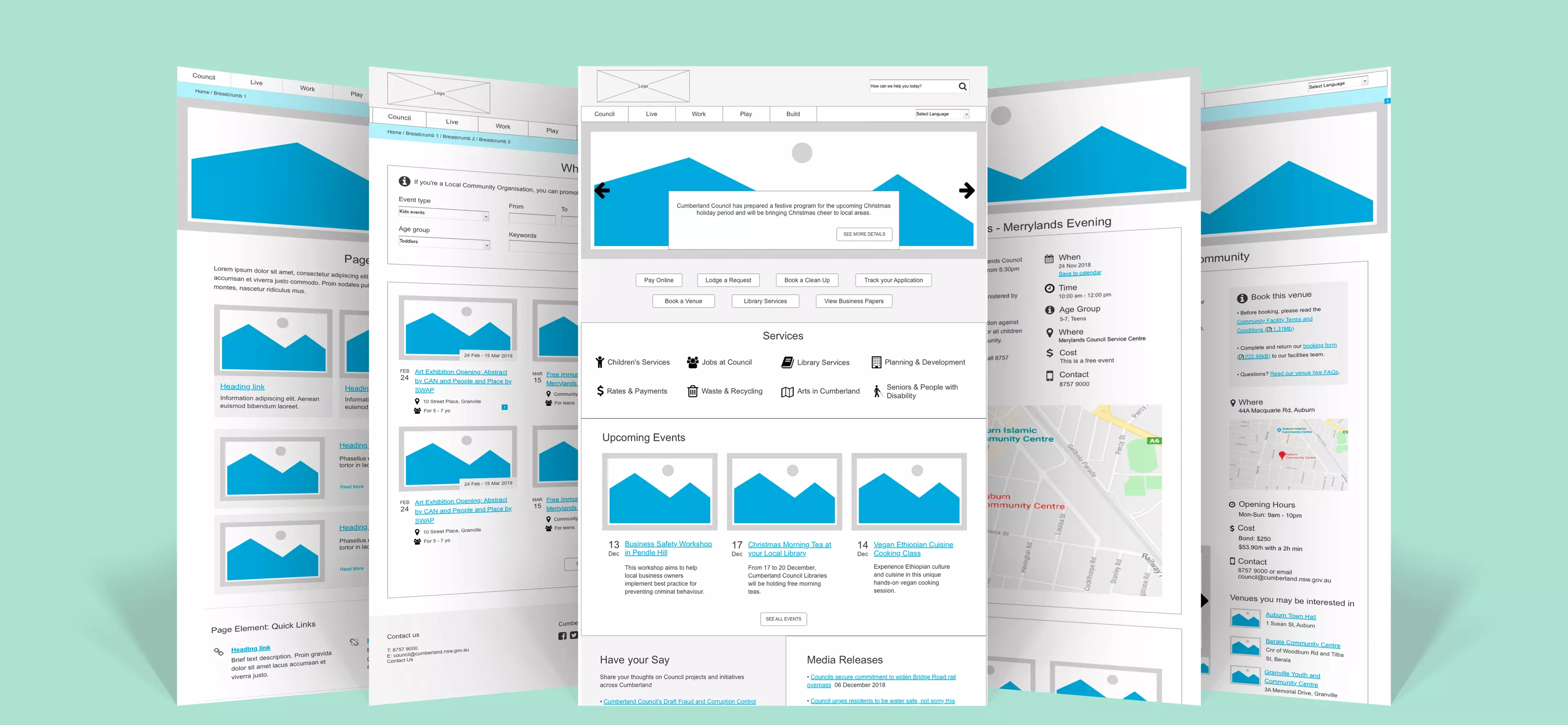
- Based on our research, we redesigned the templates with the following ideas:
- Key information is summarised and highlighted
- Reducing text, or at least “chunking” content into manageable sections
- Increased flexibility and adaptability of the general content template


